Problem statement
Over 65% of consumers seek clean ingredients in their purchases(1), but are often too busy or unable to research ingredients, taking companies at their word when they call a product “clean”.
(1) Larissa Jensen, Circana Data
Proposed solution
Dew iOS reduces friction for consumers while they search for clean beauty and skincare products by providing instant information on product ingredients.
Features:
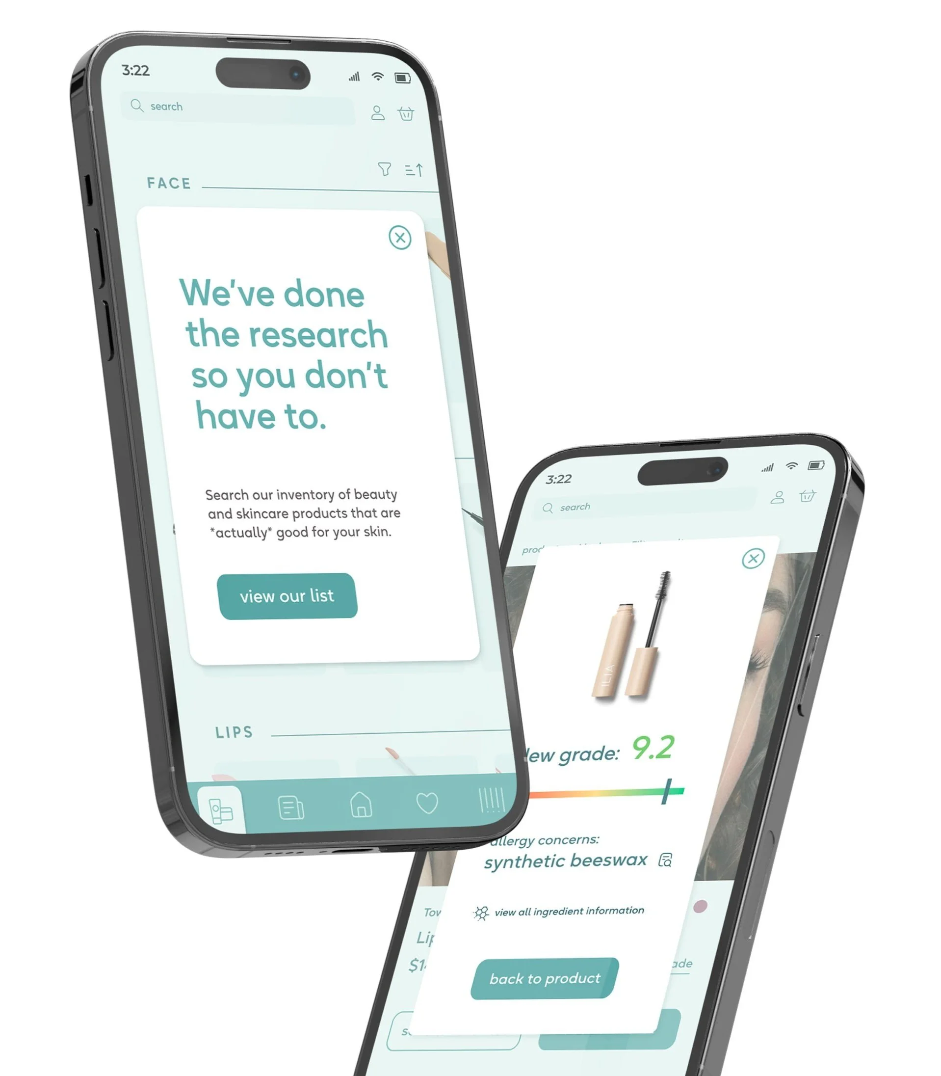
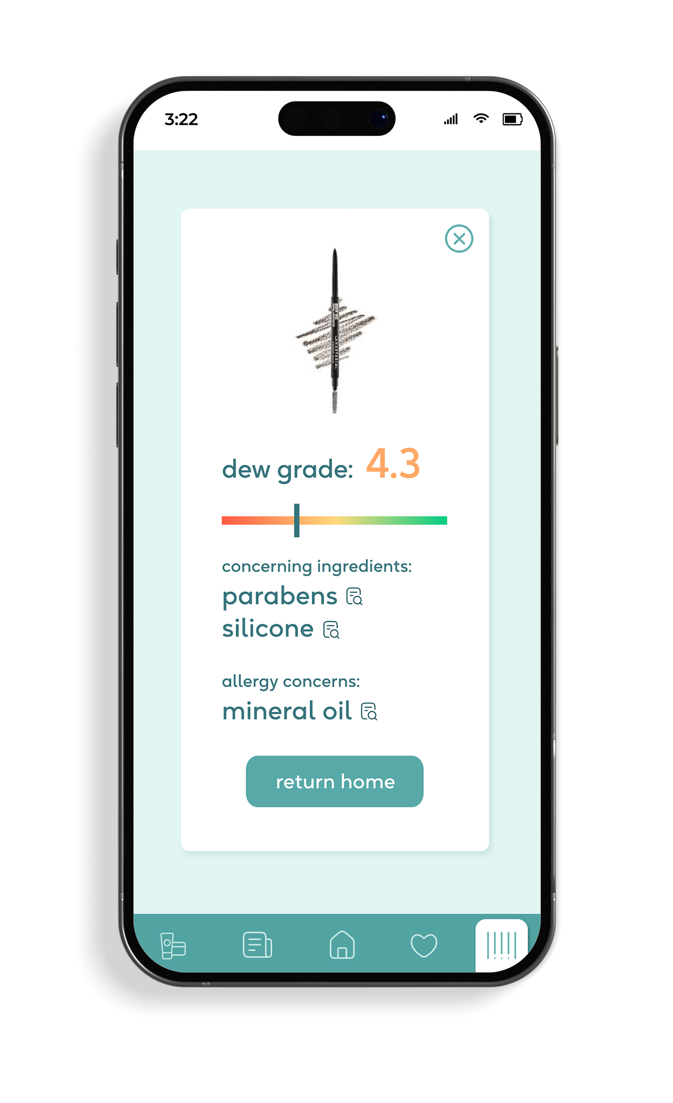
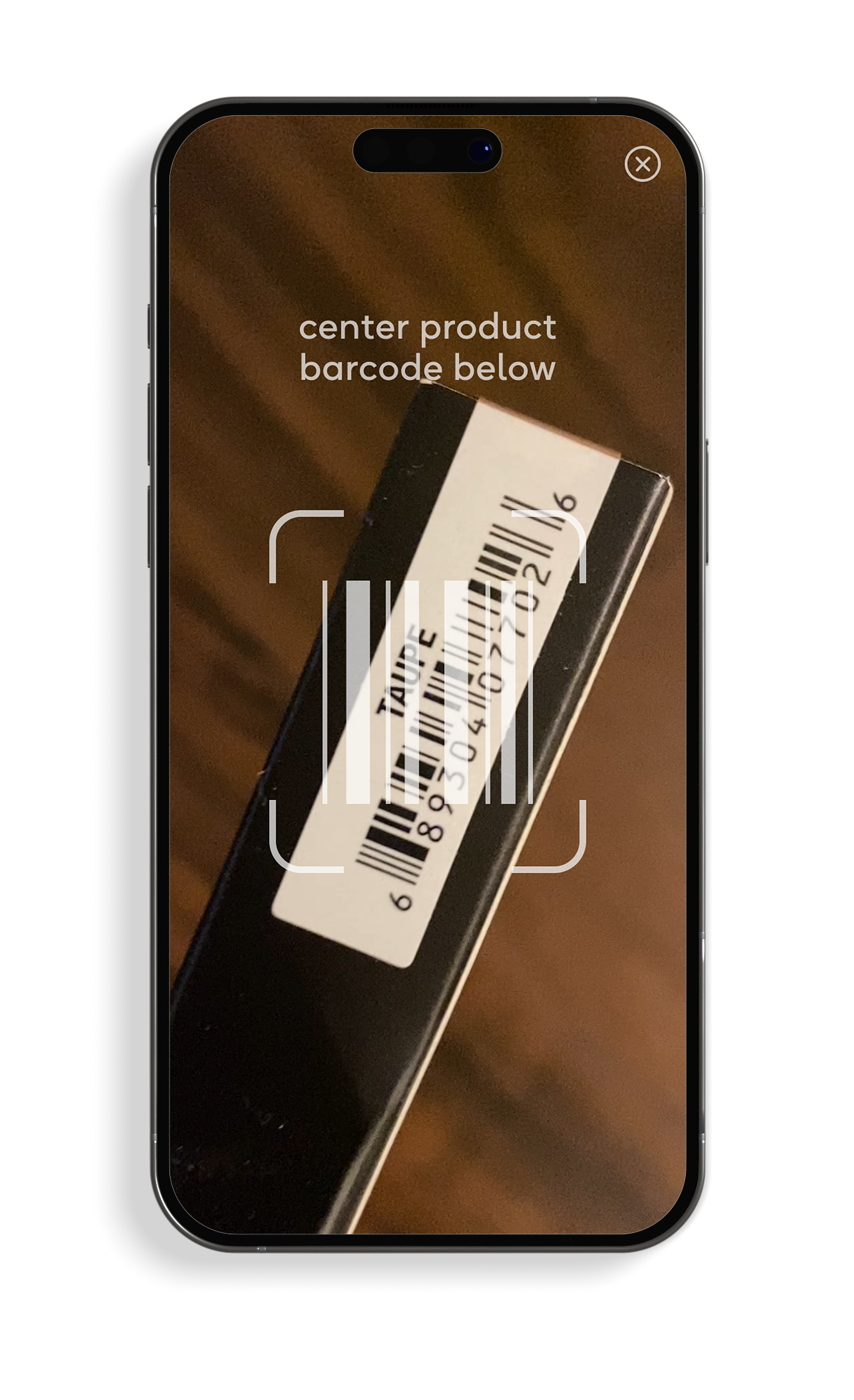
Product scanning feature
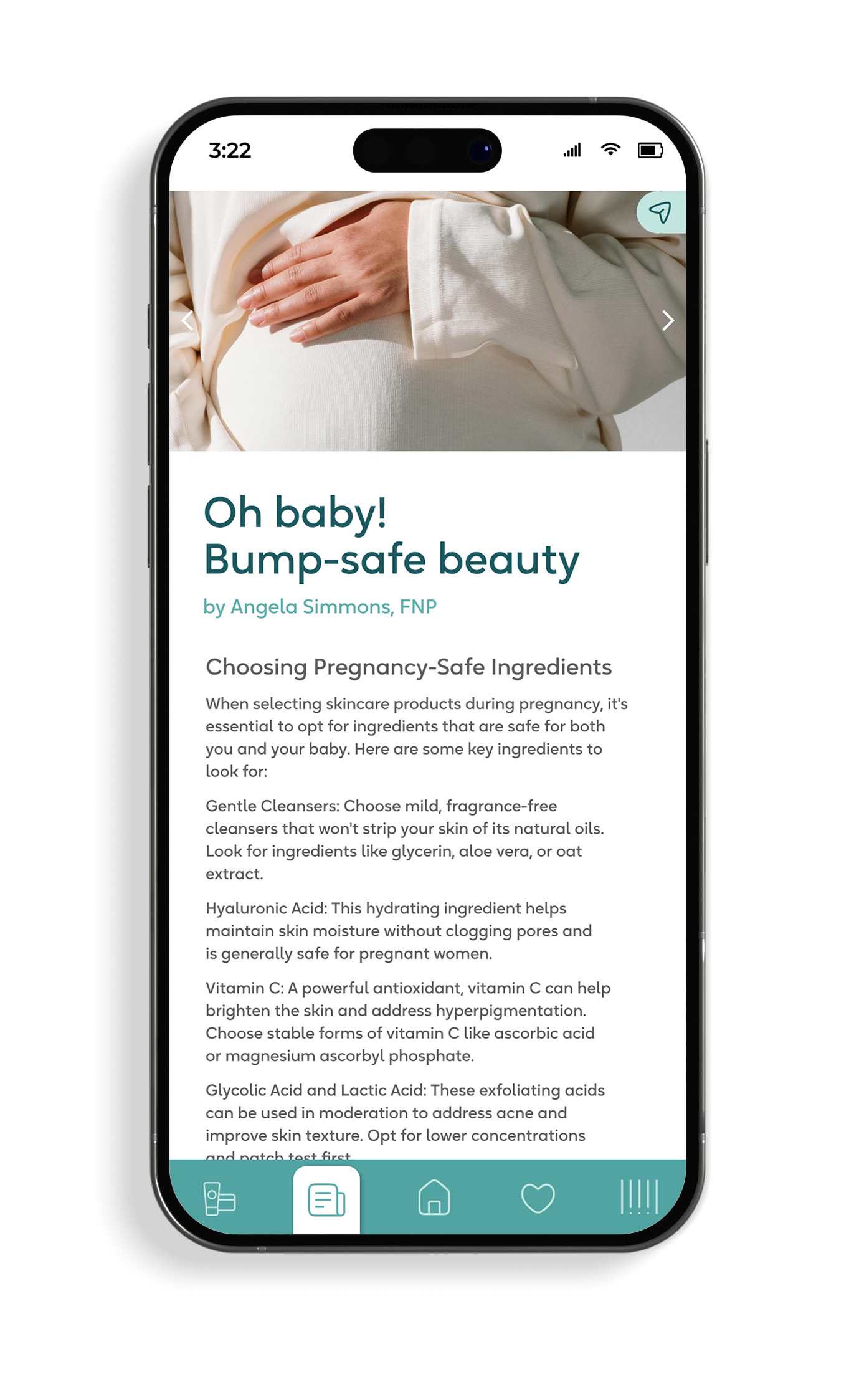
Educational articles & links to research
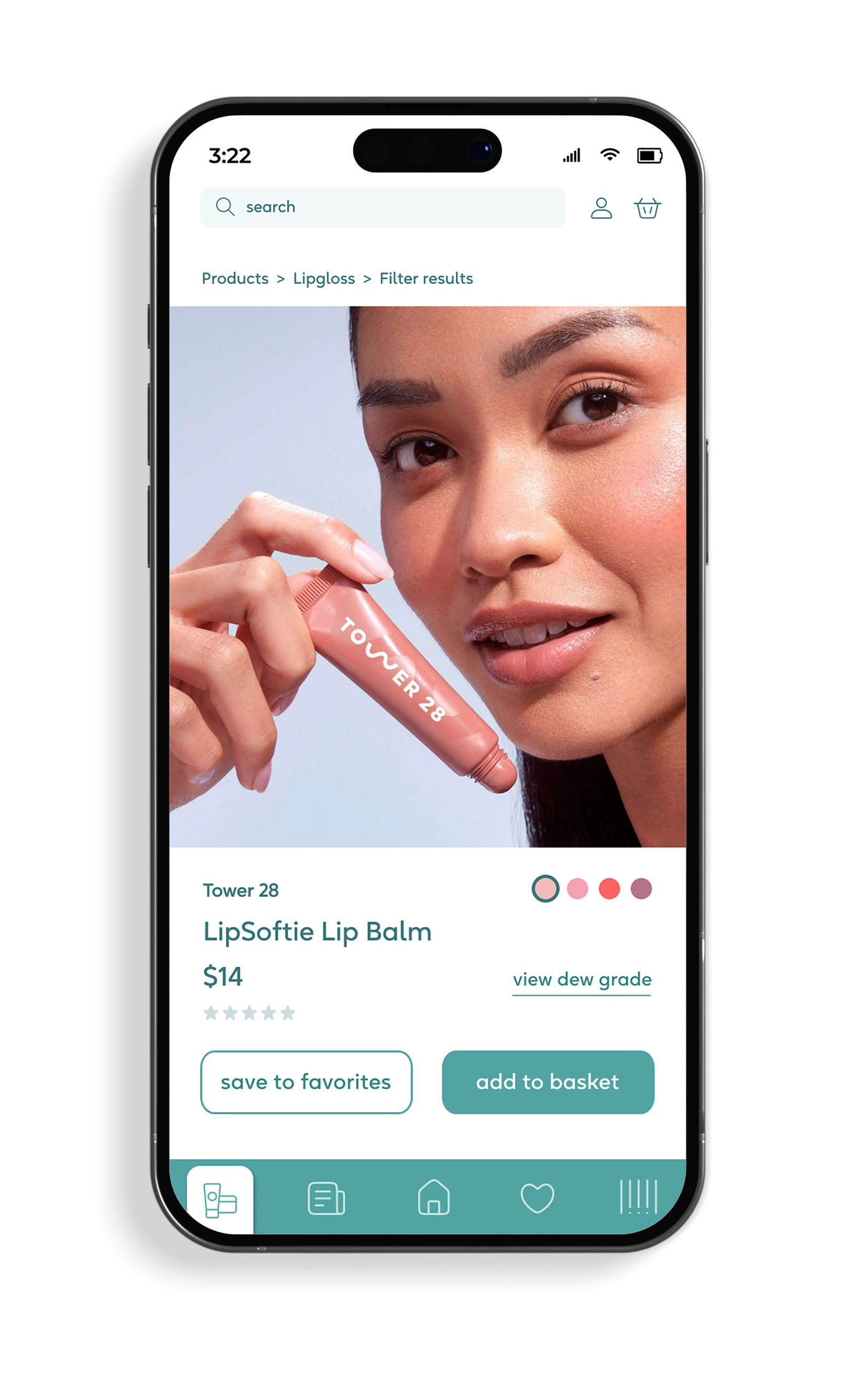
Ecommerce feature
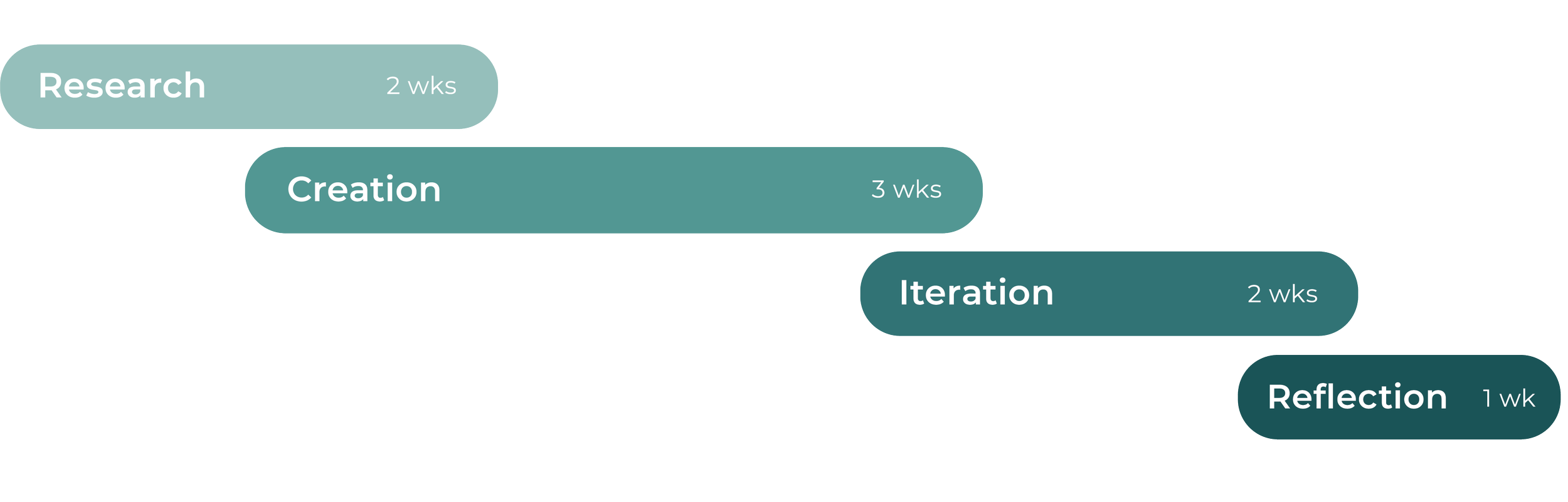
Project phases: Duration of 7 weeks
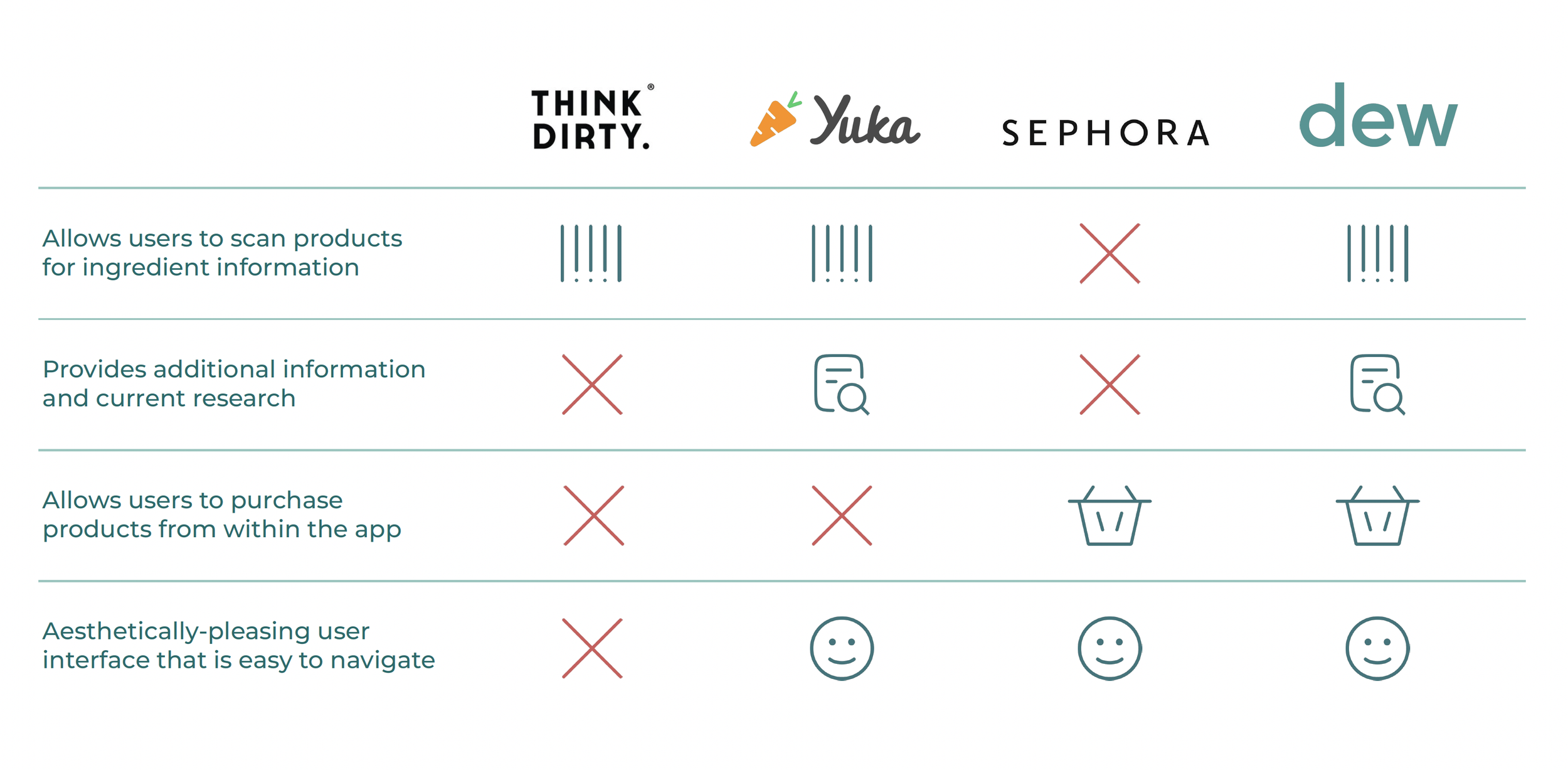
Competitive analysis: What makes Dew unique
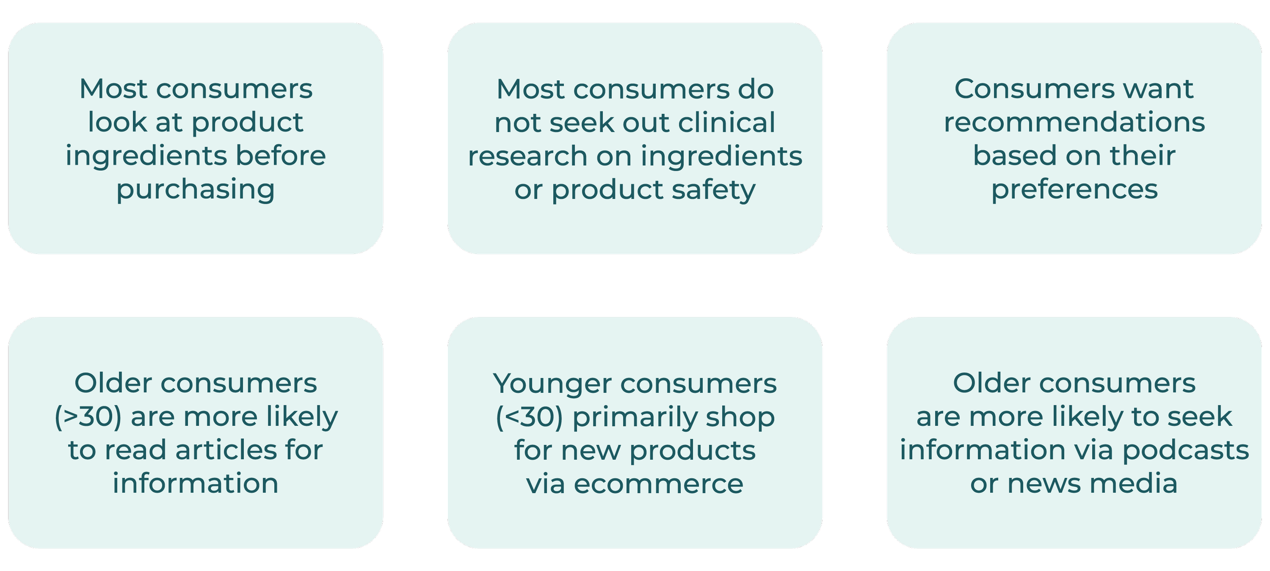
Assumptions: Consumer habits & beliefs
Desk research: Key findings
Key findings collected from research publications
>65%
of consumers seek clean ingredients in their purchases(1)
31%
of makeup users purchased makeup from social media sites(4)
48%
of participants want personalized recommendations for beauty and skincare products
50%
of Gen Z consumers rely on social media when deciding which makeup to purchase(2)
2 billion
views reached on TikTok via
the hashtag #cleanbeauty in October 2023(5)
+3%
Makeup usage increased 3 points, with the strongest increase among Gen Z and Millennials(3)
67%
of shoppers have made changes to be more environmentally friendly(6)
(1,2,5,6) Source: Larissa Jensen, Circana via Xanayra Marin-Lopez, Retail Dive, The State of Clean Beauty, 2023. (3,4) Source: Circana, Makeup Consumer Report, U.S., 2023.
Consumer survey: Key findings
Data collected from >60 participants over the course of 2 weeks via Google Form
78.8%
of participants believe there is a need for transparency in the beauty industry
60%
of participants consider the ingredients in products while shopping
32%
of participants rely on websites/ web articles to find information on product ingredients
30%
of participants say they would not use a podcast feature
74%
of participants say they trust the opinions of healthcare professionals regarding product safety
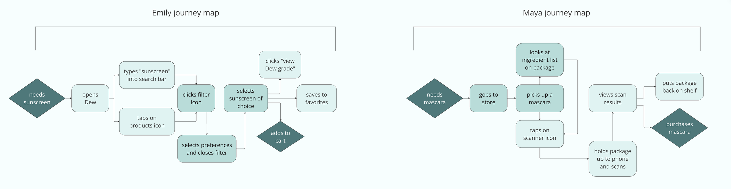
User personas: User journey mapping

Emily, 28 years old, NYC
Goals: Emily is expecting her first child. She needs to find a pregnancy-safe products and wants high-quality beauty products that meet her needs.
Pain points: Emily has purchased a few products that are labeled as being “clean”, only to discover that one of the ingredients is unsafe for pregnancy.

Maya, 48 years old, California
Goals: Maya has sensitive skin and is looking for a new moisturizer. She needs skincare that is gentle on her skin, but wants to purchase only cruelty-free products.
Pain points: Maya has had difficulty finding products that are both clean, gentle, and also cruelty-free.
Product scanner
Ecommerce
Educational articles
Additional features: personalized recommendations, favorites, Dew membership (special savings)
Key features: Minimal viable product
In order to avoid scope creep, we first focused on the following features:
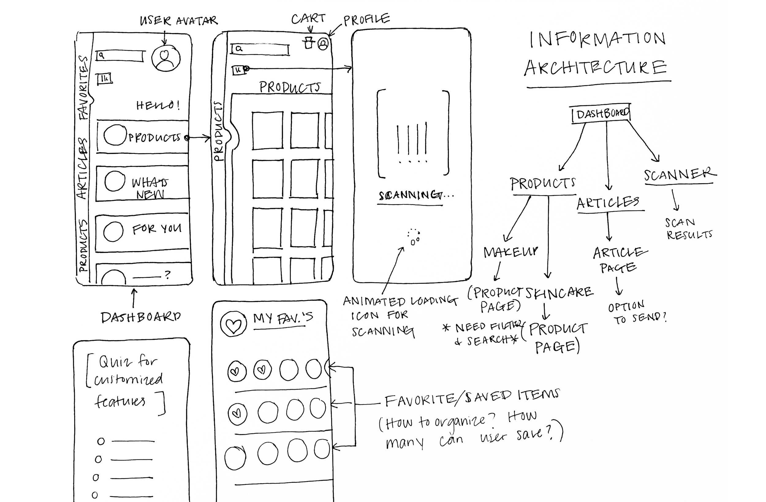
Wireframes: Initial sketches
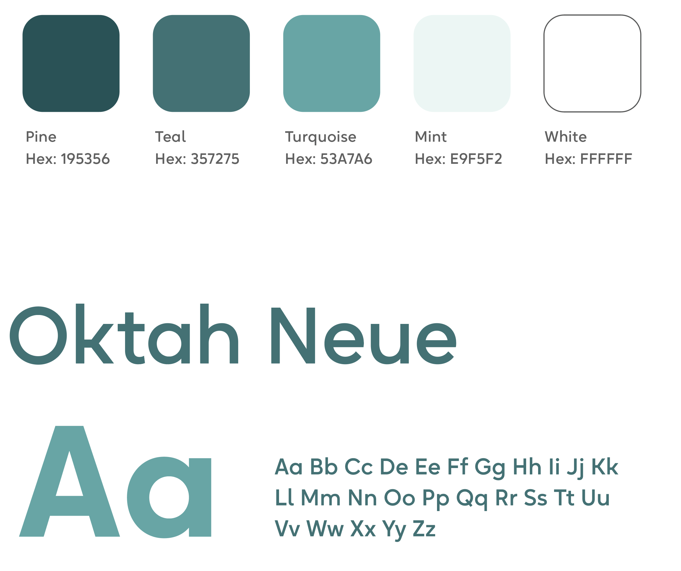
Design system: Branding and UI tokens
High-fidelity prototype
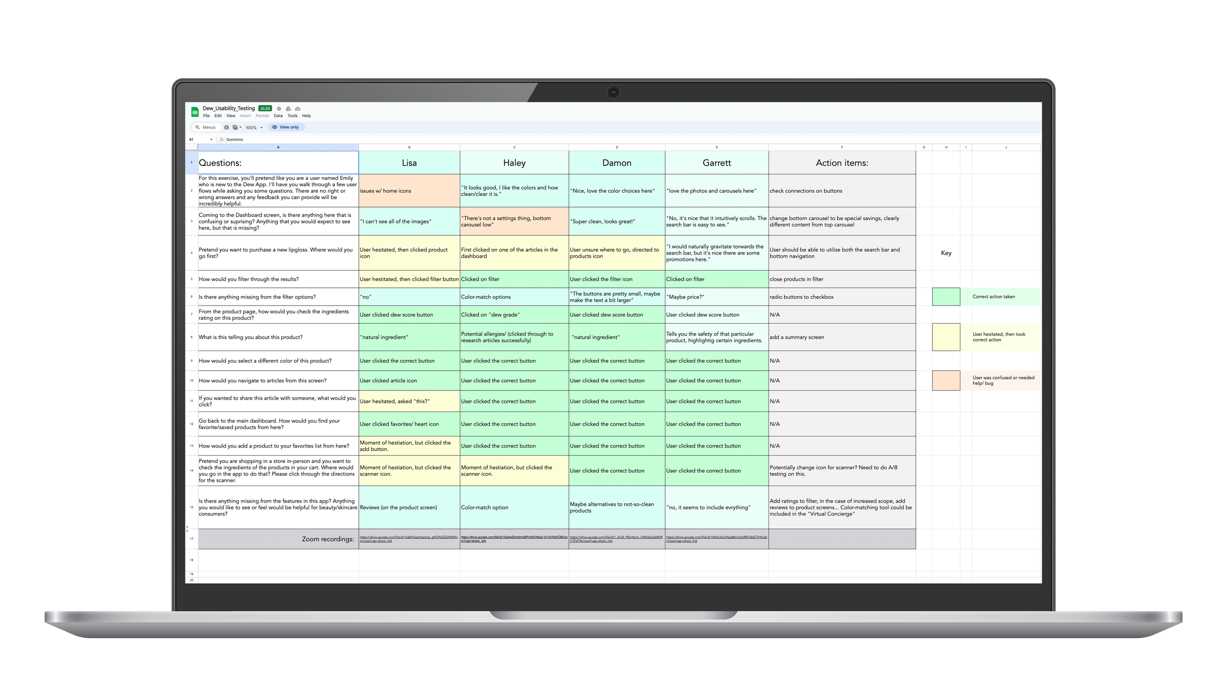
Usability testing
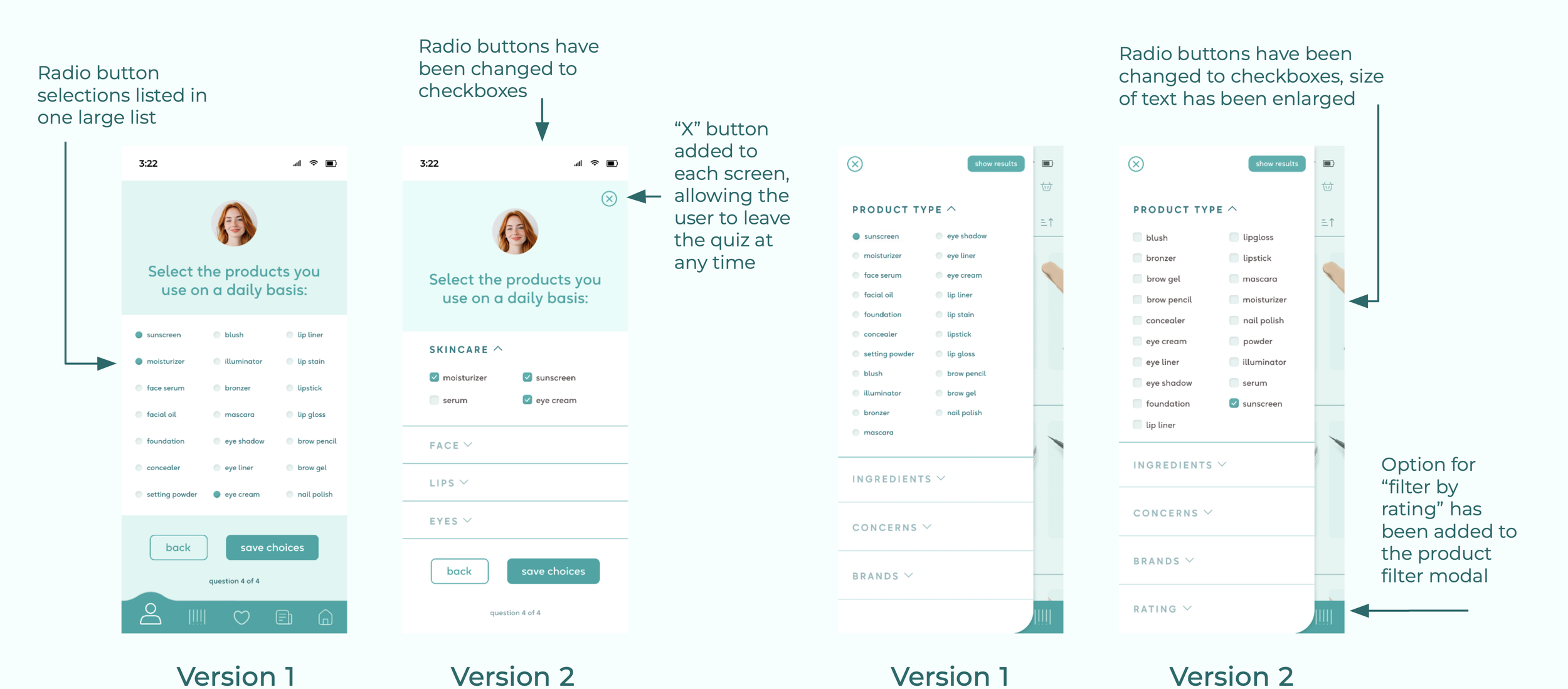
¾ users requested that the text in multiple choice forms be enlarged for readability
Half of users requested the addition of “search by rating” to the filter options
One user asked “How is this any different than Sephora’s app?”
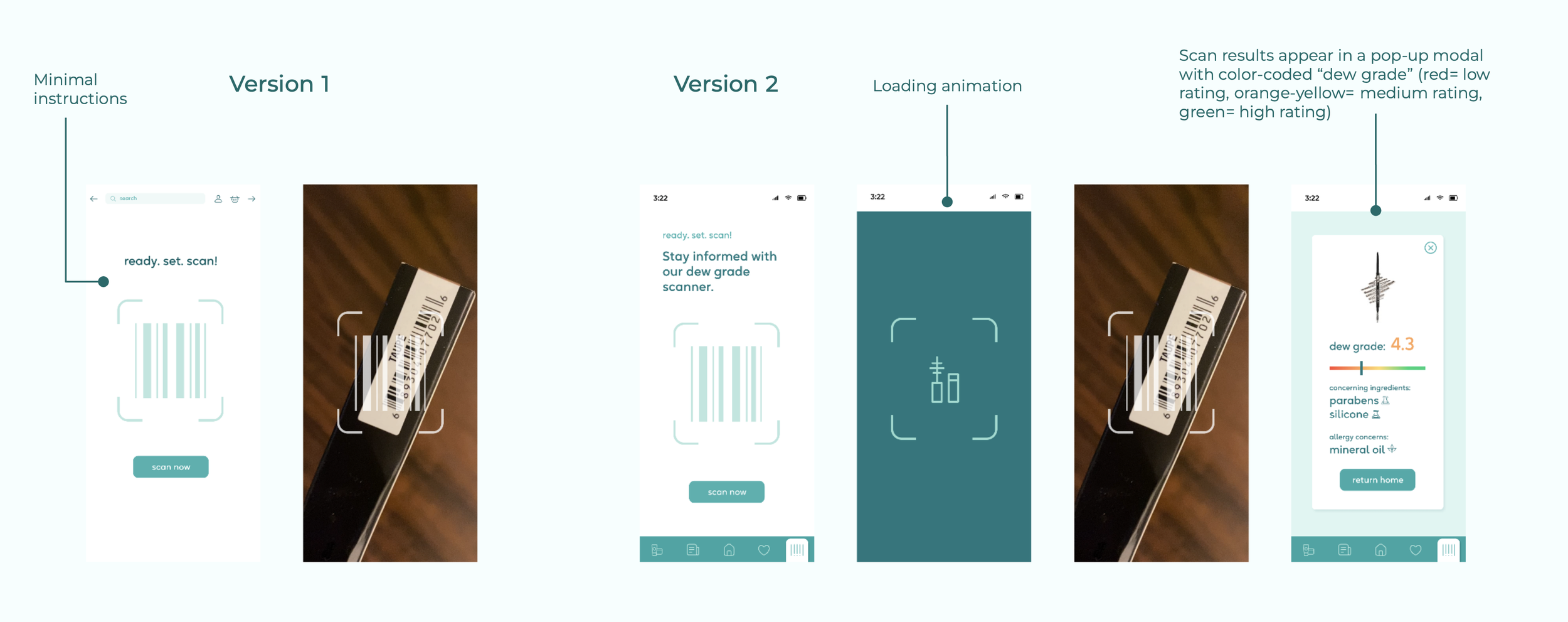
100% of users successfully navigated to the Dew Grade feature and said they understood the information presented
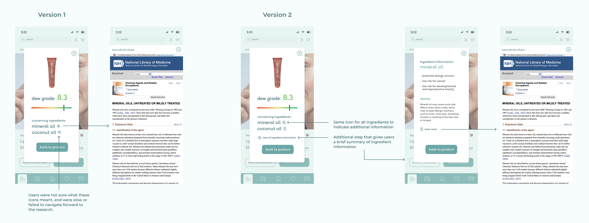
Half of users suggested changing the icons next to ingredients
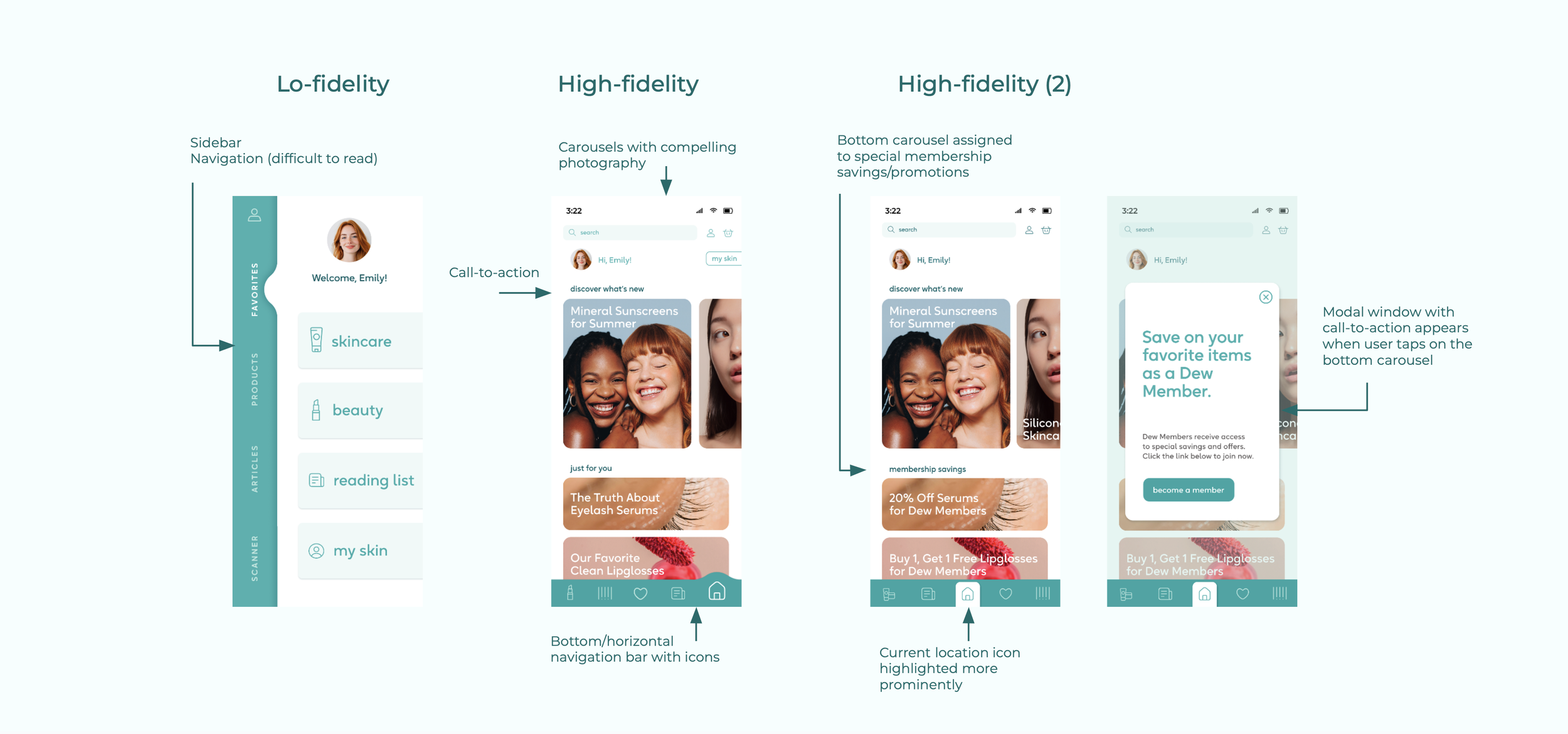
Users requested special offers & savings
Users requested a “summary” screen of research details for concerning ingredients
A few users only clicked one option on each filter category (radio buttons made users assume they could only make one selection)
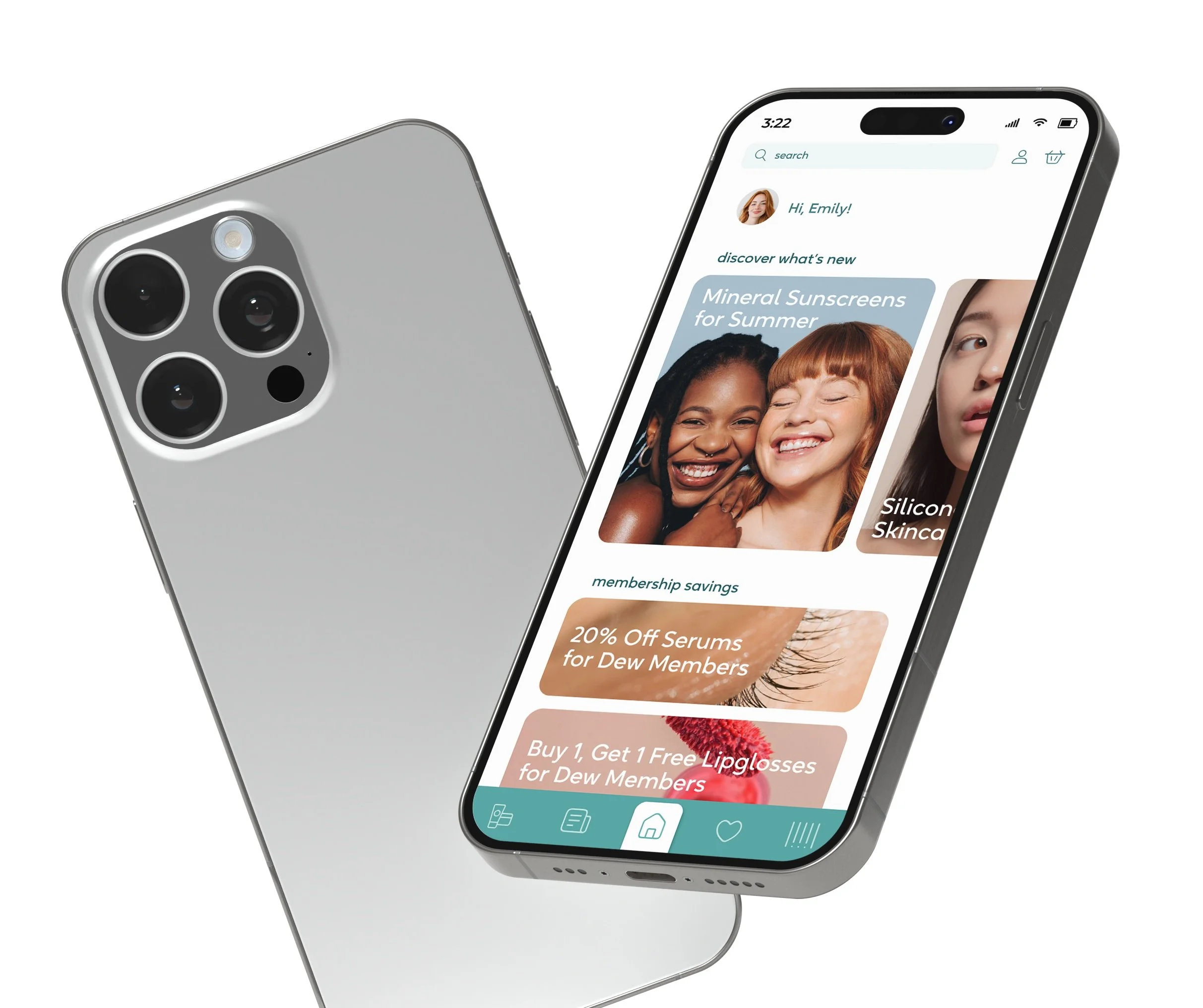
Prototype iteration: Dashboard
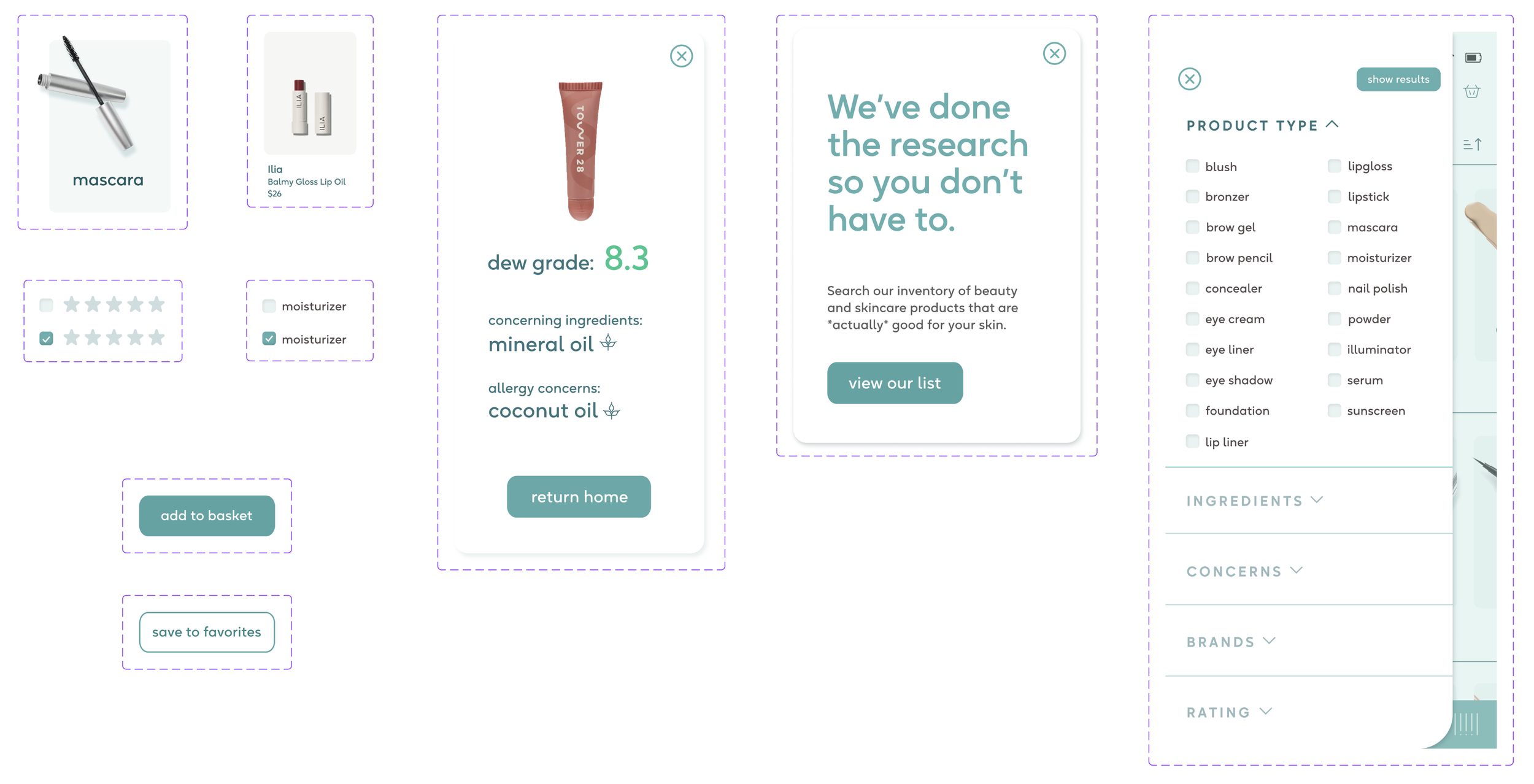
Prototype iteration: Ingredient research flow
Prototype iteration: Scanner flow
Prototype iteration: Product list in the ecommerce flow

Prototype iteration: UI buttons
Reflection
Scope creep
With so many potential features that I wanted to develop, it was a challenge to focus only on the MVP features. Many users asked for personalization features, and while I did make a personalized quiz for a product recommendation feature, I did not have time fully develop that feature beyond the quiz. Similarly, I created a couple of screens for a Dew Membership feature, but did not have time to explore what that could look like.
UI best practices
One of the things I learned was that radio buttons (or round dots) often make users think they can only select one option per question/category. In the case of the product filter, we changed the radio buttons to check boxes, which improved task completion.
Variability
Many users asked about variability within the app. Specifically, users wanted to see new content in the dashboard each time they open the app. They also said they want to be able to access special savings in the ecommerce feature. This certainly supports the theory that variability creates viability. Unfortunately, I was unable to fully realize these iterations due to scope creep.