Project overview
According to Krys Hines, a Washington, D.C.-based workplace wellness and ergonomics educator at KH Ergo and Wellness, the recent shift to remote work has aged our bodies by about 10 to 15 years.
L’Oreal Thompson Payton
What Remote Work Does to Your Brain and Body, Fortune Well
Problem statement
About 59% of Americans work from home and have suffered physically from longer working hours, poor posture, and other stressors. As a result, it has become more difficult to prioritize fitness.
Proposed solution
reFIT iOS empowers remote workers to take control of their fitness with:
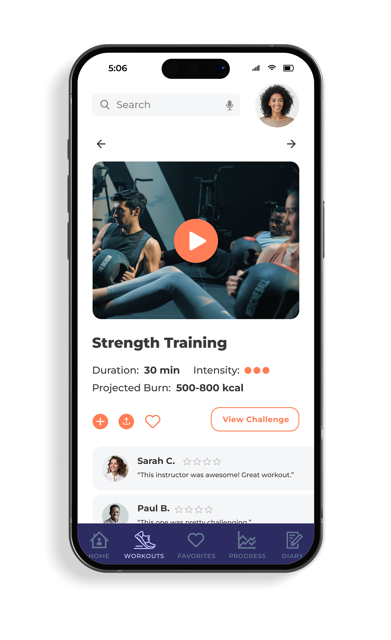
Workouts that users can do from home
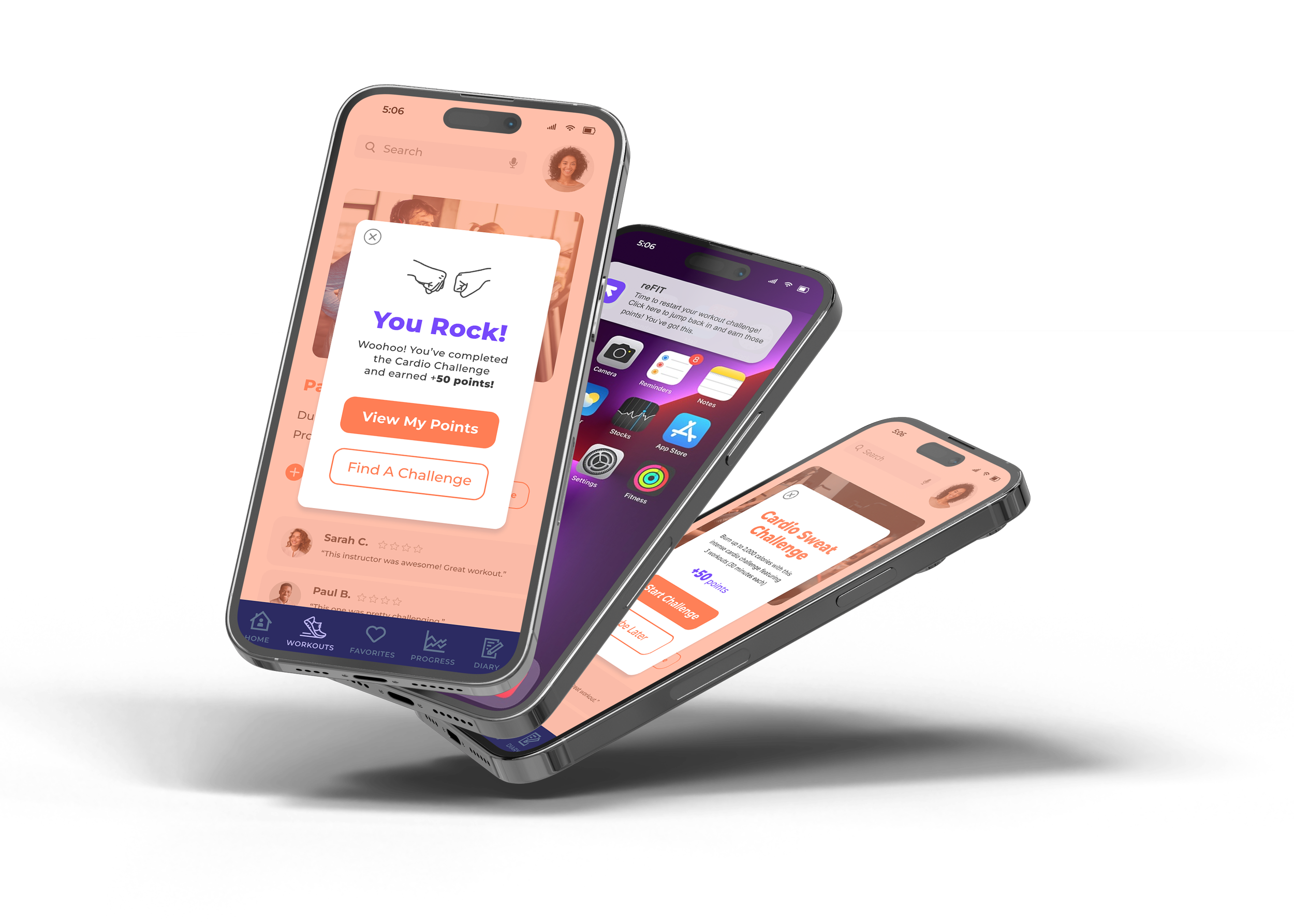
Workout challenges, reminders, and rewards
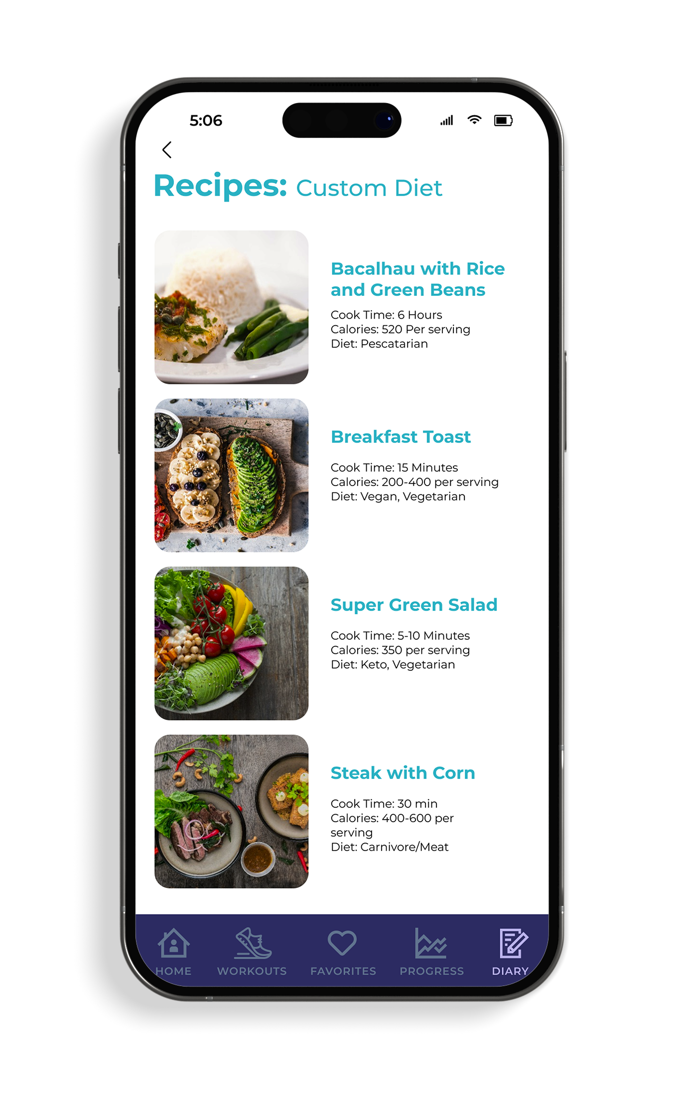
Quick, healthy recipes and a food journal
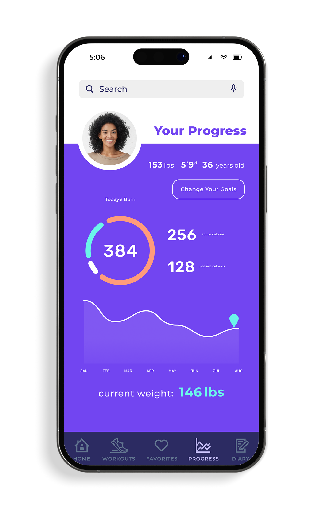
Quick-view dashboard with goal tracking
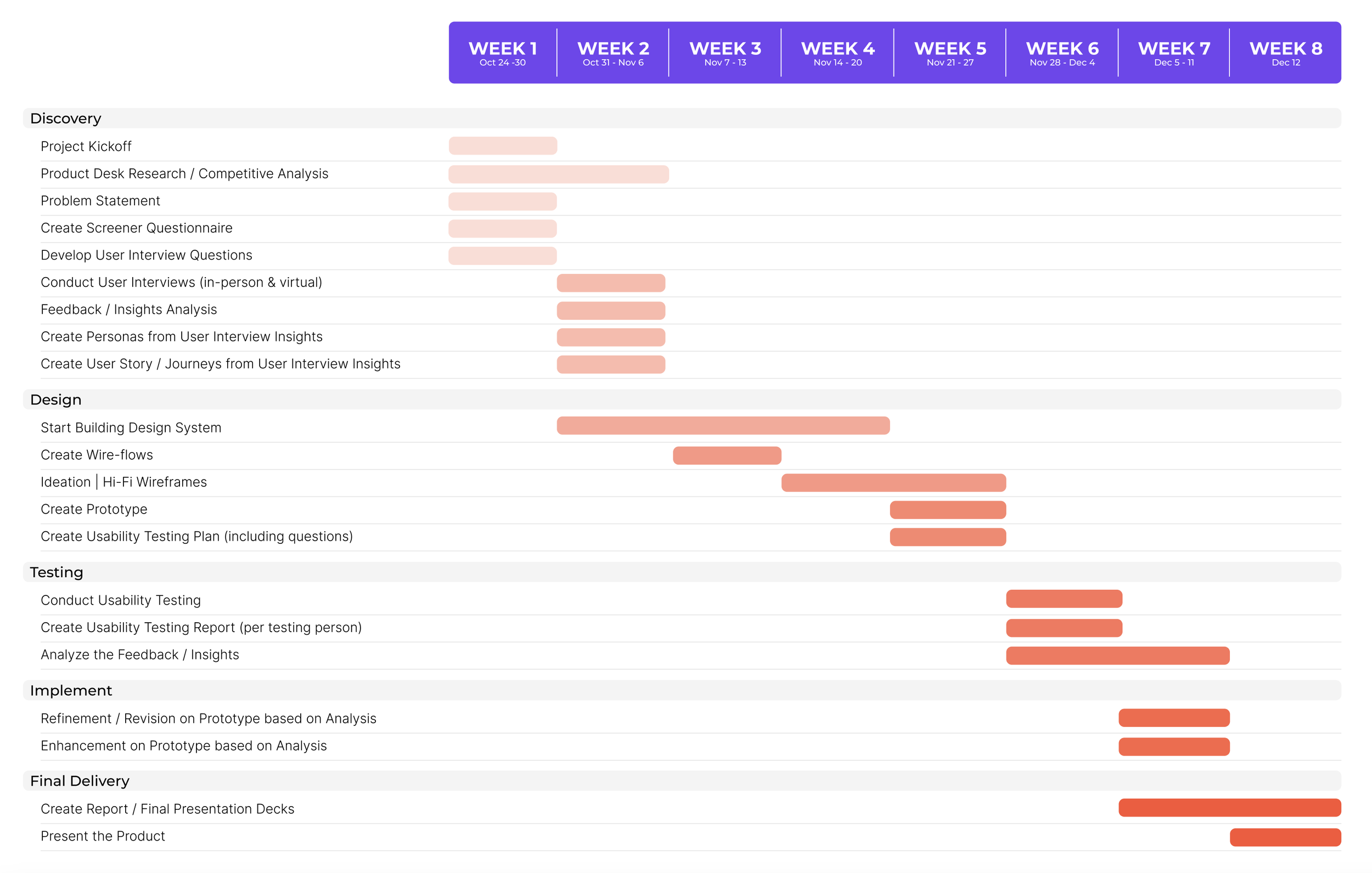
Project timeline
My role: UX/UI design, usability testing, prototyping
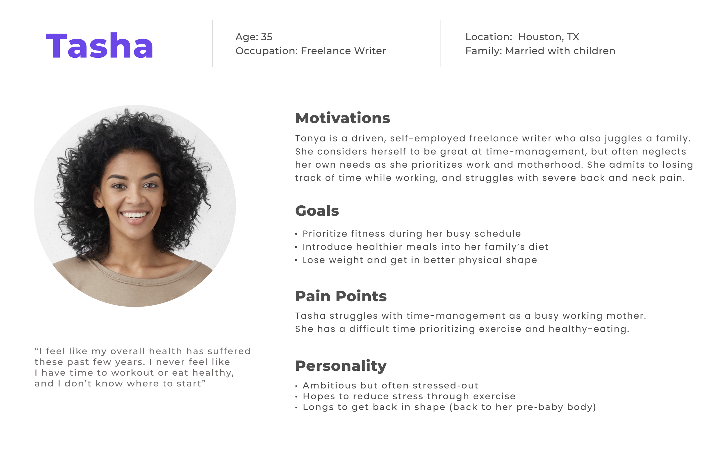
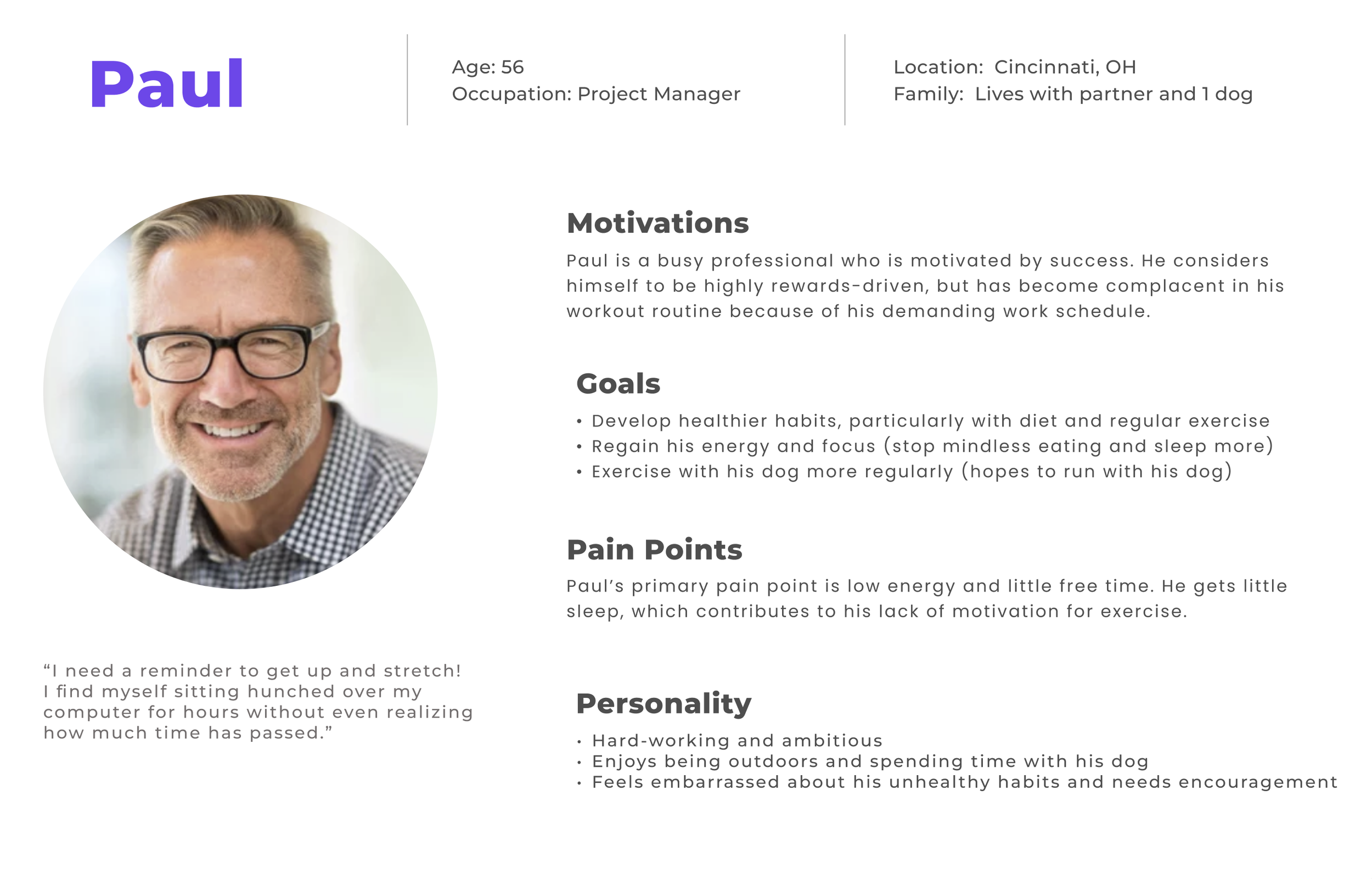
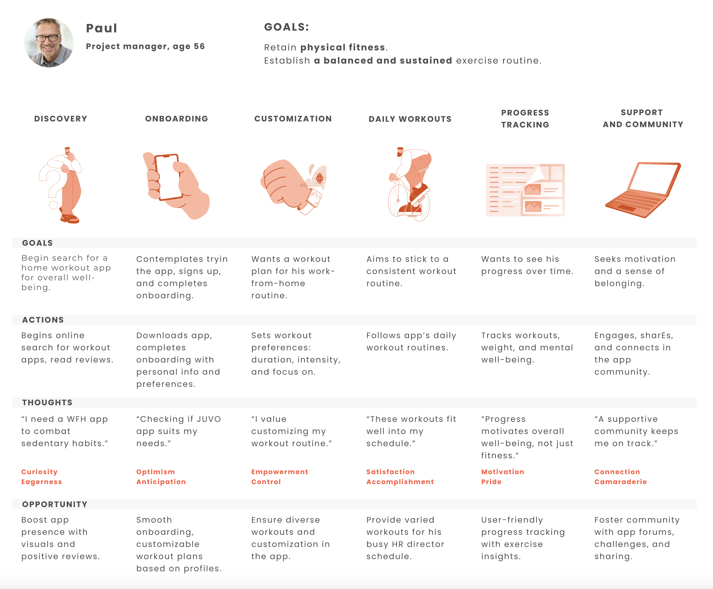
User personas
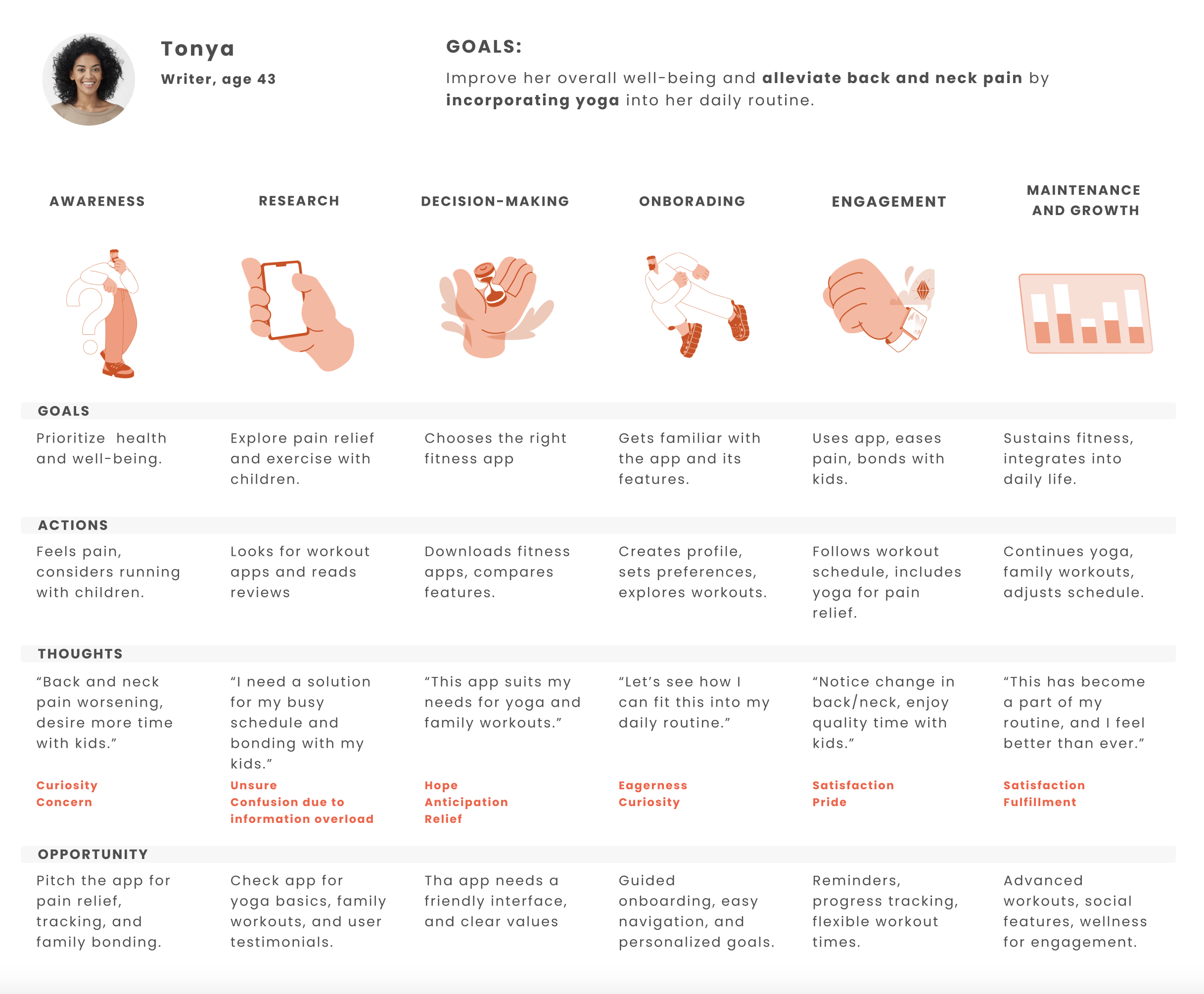
Targeted users: Goals, pain points and opportunities
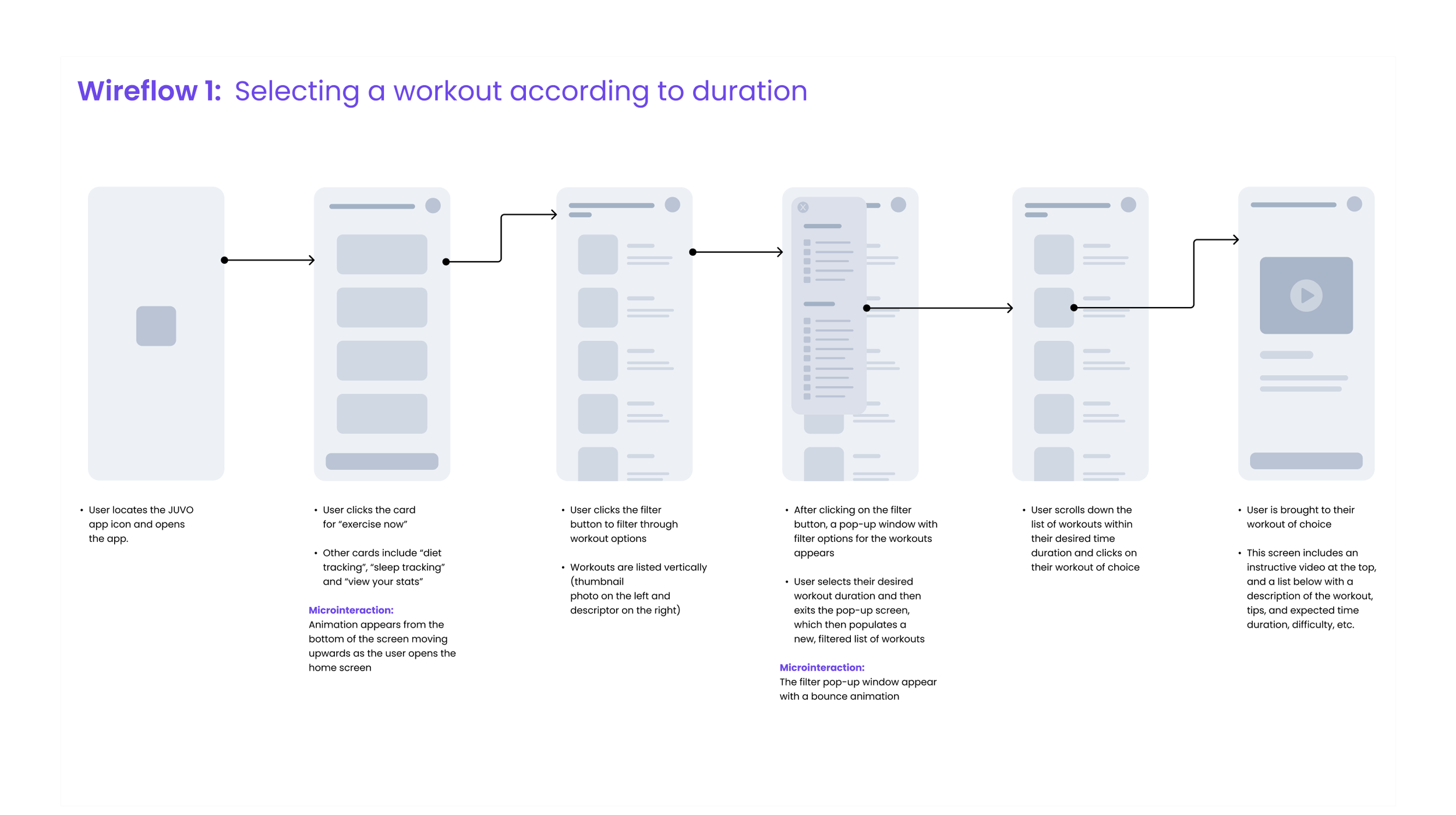
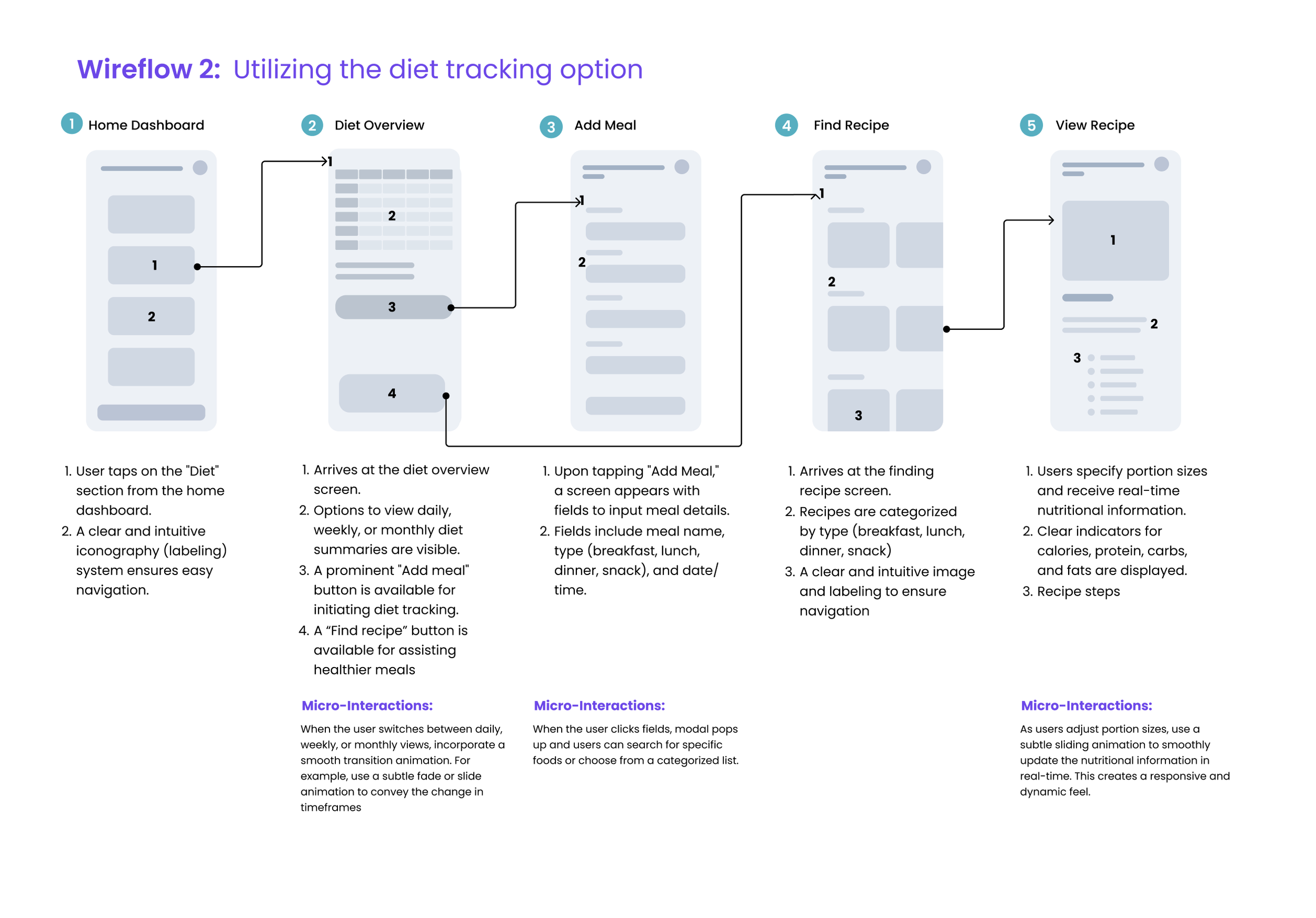
Wireframes
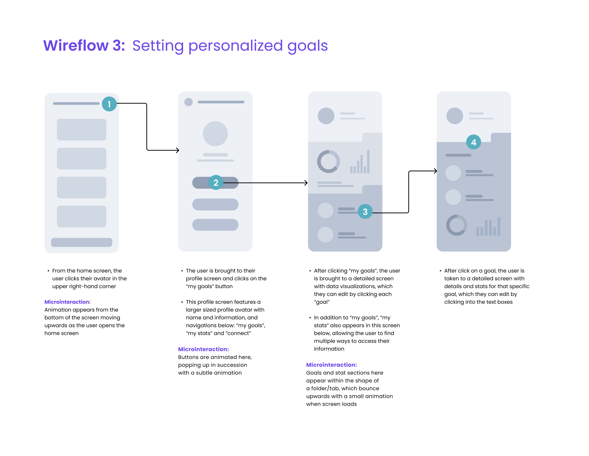
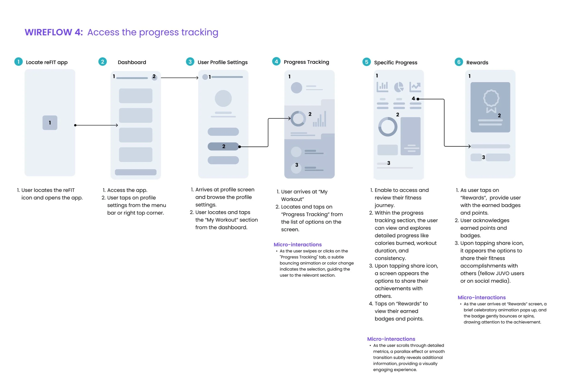
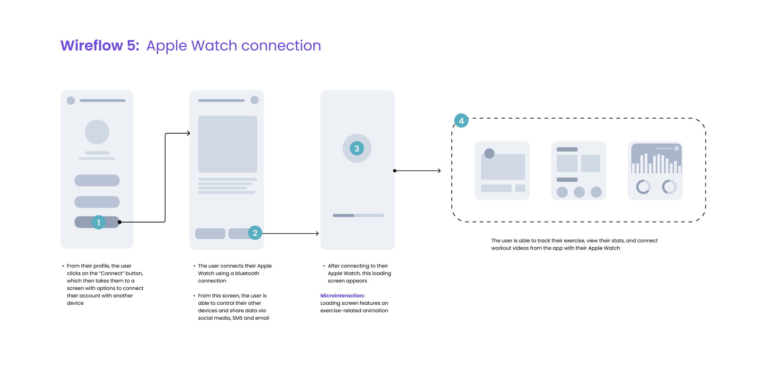
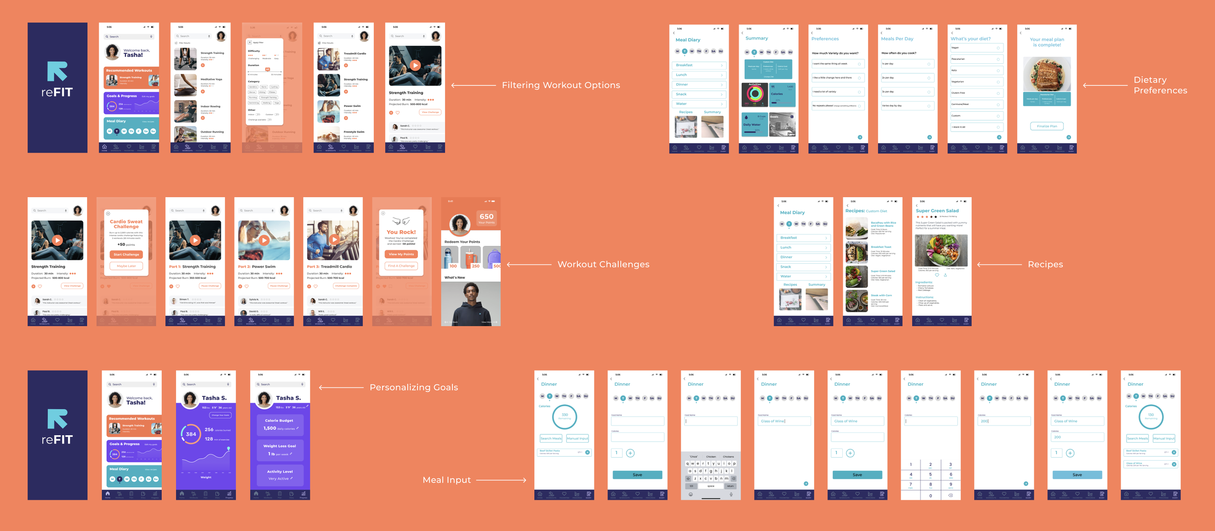
Key features: Workouts, goal tracking, recipes/calorie tracking
Design system
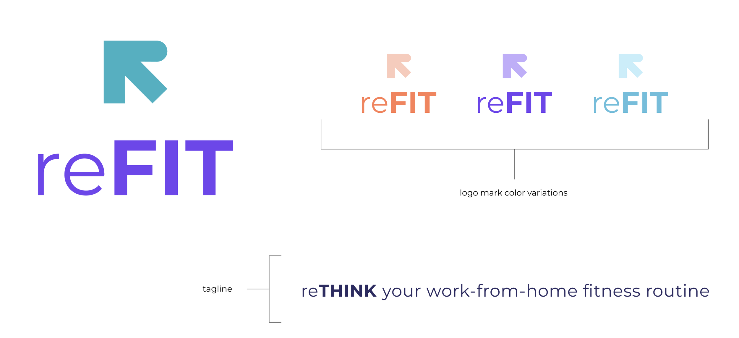
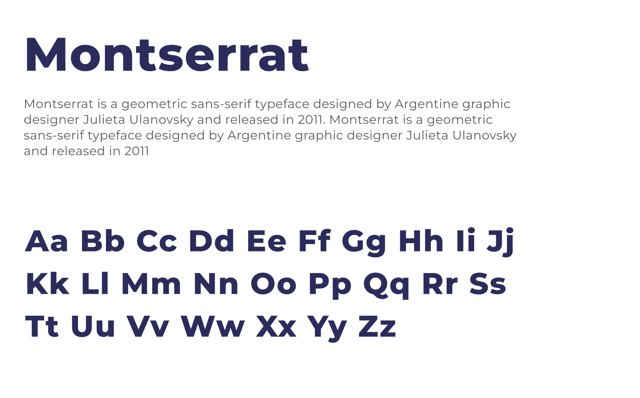
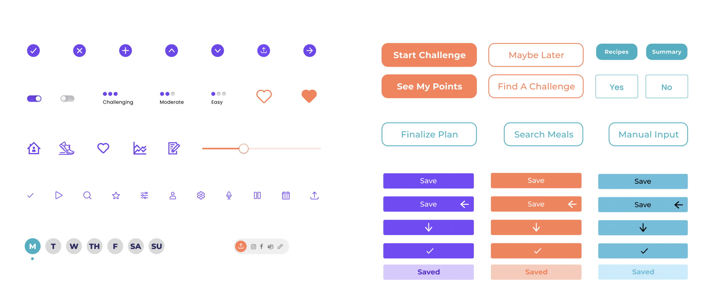
Design system: Branding, typography and interface controls
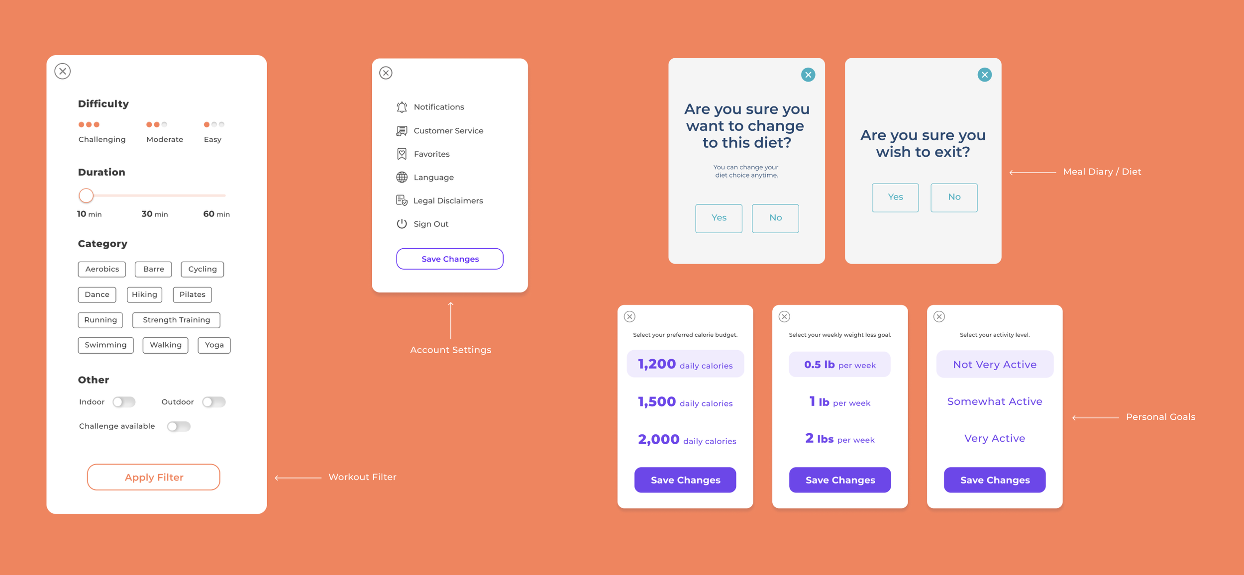
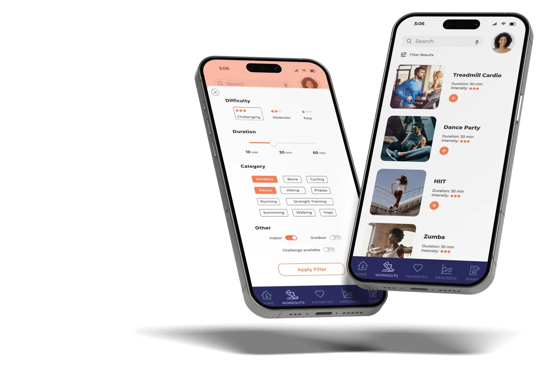
Exercise filter & modal windows
Usability testing: User observations and subsequent iterations
• 3/6 users did not realize that filter selections were updated upon closing the filter modal
To give users a sense of completion, we added a button at the bottom of the filter modal that says “Apply Filter”
• The nutrition summary screen in the dietary flow competed too much with the main dashboard, and 2 users asked how it differed than the goal summary screen
To alleviate this confusion, we eliminated the nutrition dashboard screen and instead, directed users to the meal diary screen
• 4/6 users mentioned not being able to pause a challenge, or how they could save their progress if they were pulled away during a busy work day
To give users peace of mind, and eliminate friction while participating in exercise challenges, we added a “Pause Challenge” button and added a reminders feature so that users can set reminders to restart their challenges
Prototyping: Hi-fidelity flows before user testing
Prototyping: Final prototype
Reflection: What I learned
1. Ensure that all team members are in agreement on which features to pursue for the MVP
Our team had difficulty in deciding which features to focus on. Scope creep made it impossible to build out the Apple Watch connection, and because it was the last feature we turned to, it was removed from the prototype.
2. Adding an “apply results” button to a filter gives users a sense of completion
During the usability testing phase, we did not have a button to close out the filter, only an “x” button in the upper right-hand corner of the filter modal. We noticed that a few users went back to the filter to redo their selections, thinking they had closed the modal too early. Adding a button that said “Apply Results” eliminated this issue.
3. Reminders give users a sense of control and protection
Similar to an alarm clock, reminders ensure that users can come back and pick up right where they left off, avoiding wasted effort.

